
Getting Planes out the Door
hackathon, cross-platform, fully-built
In one week I worked with a team to create a proof of concept for a system to manage airplane turnaround times, the time between an airplane landing and flying out again with new passengers. The system connects a command room view tracking all activity and a mobile view for ground workers, with the goal of facilitating communication and quickly identifying issues in order to reduce lost time in the turnaround period.
Role
Co-Product Owner, Mobile Designer
Tools
Sketch
Platform
Desktop, Mobile
Background
As co-product owner, I had a lot to learn in two days. Through a few meetings with the client, we familiarized ourselves quickly with problem space. Airlines precisely time their flights to maximize profit, but we've all experienced when that schedule is thrown off and delays cascade. During the turnaround period an airline must complete several tasks, including cleaning the plane, refueling, and loading baggage. In order to supervise and manage delays, they need a way to make this period more transparent. They also need a way to offload task management to ground workers, lightening the load on central command.
So, now that we're all up to speed, let's begin, shall we?
Digging into the Problem
We sifted through meeting notes to identify the priority issues...
-
Minimize cognitive load
-
Scannability and glanceability
-
Alerts must be actionable
... As well as our key personas:
-
Airline manager (surveying multiple airports)
-
Baggage handler
After briefing the team on the problem and the technology limitations, we began designing our interfaces. I was in charge of the mobile display for the baggage handler.

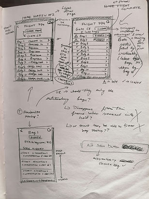
Some quickly-scribbled meeting notes while clarifying requirements
Designing for the Hidden Hero
Here's the run-down on our guys' day-to-day in the baggage world:
-
Technology - he uses a Dolphin, a super rugged, dumbed-down, Android device
-
Conditions - he's in and out, sometimes on the tarmac with the luggage, sometimes in the belly of the airport
-
Context - he's only concerned with his part of the turnaround process, so he has no direct communication with airline management. He would receive his assignments automatically via the airline manager's desktop app created by the other half of the design team.
In order to reduce the cognitive load, I went in with a few key points. The baggage handler had to see only the information pertaining to his tasks. His display should be in light mode to handle the glare on the tarmac, and only the alerts should stand out so that he knows without a second thought when something has gone wrong. Alerts should also be accompanied by a call to action so that he can immediately handle the problem. Finally, information should start broad and concise with the option to drill down.


Each screen has a single purpose to simplify decision-making, and information is displayed chronologically to prioritize time-sensitive tasks. I also chose push notifications over full screen calls to avoid interrupting workflow.
Taking it to the Next Level
After clarifying questions that came up while sketching, I moved on to the high fidelity mockups.


A few of the screens from the initial design
In our design review, the team identified several areas for improvement. Here are a few:
-
Since the information is chronological, why not make the displays look like a timeline?
-
Reduce the clutter of lines and grey shades
-
Add a countdown so the baggage handler has a status indicator
With those comments and several others, I went back to work.


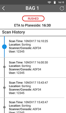
After confirming the assignment (propagating feedback to central command), the baggage handler sees a timer, indicating status by color. Information increases as they drill down, allowing them to survey general conditions or track down a specific bag.
After the team signed off on my updated screens, I switched to bridging the gap between the design team and the developers - clarifying and defending specific details and guiding modifications due to tech and time limitations.
And we all lived happily ever after.
Really though, the dev team built a fully functioning app in just four days - a stunning job bringing our wireframes to life. The client was extremely pleased and planned to take the proof of concept back for further business considerations.
Looking Back
The time limitations left some details out of scope, especially the consideration of error prevention. Given the chaotic environment of a baggage handler, I would have liked to build in some prompts to avoid accidentally completing a flight or confirming a new assignment.