
Supporting the Support
concept design, information architecture, web
I designed a dashboard to help the hidden heroes working in customer support. The new portal allows tech support to quickly glance at the status of a customer's account, perform essential functions from the overview page, and drill deeper when needed. The dashboard takes into account complex existing information architecture as well as possible future growth in functionality.
Role
Tools
Platform
Designer
Sketch
Desktop
Background
At the time, support workers logged into a simple site that displayed a list of all the customers' information. From this list they could access an individual account and assist with issues, often while on call with the customer. Although not visually appealing, the site served current needs. However, the support portal would soon need to service multiple products, introducing significant complexity. A tech service call isn't the time to get mired in a complicated data display, so we needed to re-imagine the dashboard structure. Hence our mission: help support workers solve problems faster. And save their sanity.
When I began the project, there were still a plethora of questions about the direction of the portal, so you'll see that the designs are really a continuous process of discovery.
Discovering and Designing
I started by exploring the current support portal, listing all the information I did have (very little), and all the questions I needed to answer (very many) in order develop a structure for the site. Here are a few:
-
Which information is specific to the customer, and which information is specific to a product?
-
What is the hierarchy in the information structure?
-
Do all customers have at least one of the products?
-
Does the current number used to identify customers persist across other products?
-
Will support workers be able to log into other products in the future?
-
Do all customers require the new functionality (api key management)?
I worked with a senior designer and the manager who initially requested the redesign in order to clarify the details. This is the moment when I first encountered a quintessential element of design: shifting needs. In each whiteboard session, the answers to my questions kept changing, and in the end the consensus was often: "This is how it is now, but it may change."


Furiously scribbled initial notes when I first discussed the project


Whiteboarding to clarify new requirements and future possibilities
As I got a handle on the data, I began brainstorming ways to arrange and present it. I drafted several variations of each of the tables - partly to reflect my evolving understanding of the hierarchy and functions, and partly to find ways to reduce clutter and better guide the eye over the page.

A peek at the reasoning behind the dashboard features (initial design)
I tried to examine literally every possible arrangement. As an example, take the journey of the overview information table:


You can see the shifts in my understanding of the data hierarchy as I explored the possible arrangements
Dealing with Complicated Data
The main challenge boiled down to two issues:
-
Making complicated data relationships look simple
-
Making a point of data "locatable" in a deep array
I drafted several versions of multi-layer tables, which provided two advantages: 1) Embedded information could accurately represent the data hierarchy, and 2) Support workers could quickly drill down where they need more details.

Started with tabs outside of the table, ditched them to avoid confusion when tabs are used at a higher level

A divided table to capitalize on horizontal space

A couple of tables with layers to handle full complexity: A) Horizontal and vertical tabs so that tech support can focus on one thing at a time B) Columns + embedded tables for max compartmentalization

Vertical tabs + embedded tables

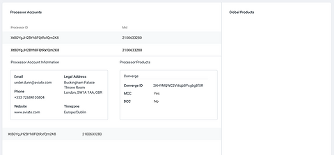
Final design based on latest understanding of information structure - the sweet spot among my objectives.
The final design uses a split view that helps staff to quickly search for a specific processor on the left and see details on the right. The design is simpler than my intermediate ideas since I was directed to design an initial version of the dashboard and leave out certain details for future expansion.
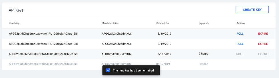
Feature Spotlight: API Key Management
In addition to obtaining client information and providing remote account access, the dashboard allows support workers to assist customers in managing their API keys. The primary function is creating a new key, so I placed a quick access button in the table header. You can see how the table works:


And Now for the Big Reveal...
