
Playing in the [ API ] Sandbox
web, information architecture, fully-built
I designed a website that would serve as interactive documentation for a new API being released. In addition to providing details on each API call, the site allows companies to test them and see responses in embedded code areas. After the initial design cycle, I took a step back, studied another UI perspective, and redesigned the site.
Role
Tools
Platform
Designer
Sketch
Desktop, Mobile
Background
E-commerce security is strict, and their APIs have many requirements, hence documentation is even more important than usual. Method descriptions are helpful, but to truly avoid the frustration of guess and check, a sandbox is invaluable. In this instance, the idea was presented by a developer already working on the concept before I joined the team. He'd built a bare bones site to hold the information and test out the interaction; I loved the idea after playing around with the page, so I decided to fly with it.
Taking it Further
The interaction concept already satisfied one of my priorities: it alleviated the frustrations inherent in working with the back-end - making the black box transparent and restoring control. My next move was handling the layout.
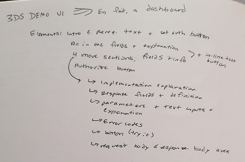


Collecting information for the layout and brainstorming arrangements
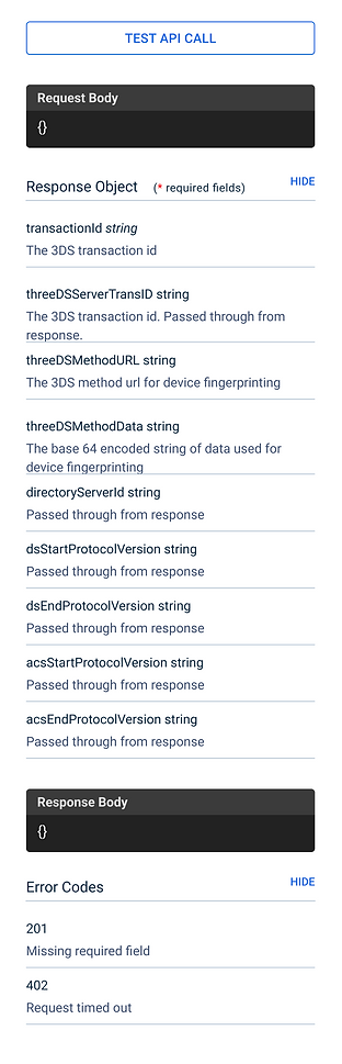
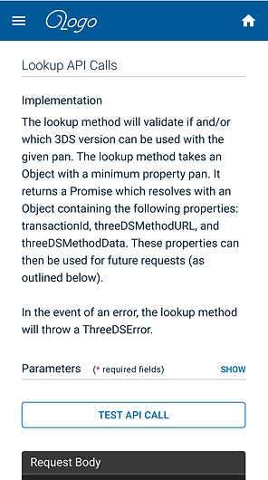
I started by taking the exhaustion out of digging through parameters and response lists. Highlighting the overview at the beginning of the page saves developers time by telling them quickly whether they need to consult that page or move on. Below the overview, I placed the lists side-by-side with the code boxes so that developers wouldn't need to scroll up and down as they test their calls. There's nothing more reassuring than immediate visual feedback, so as they fill in parameters on the left, the message calls begin auto-populating on the right, ready for testing. There's no need to search for the results because the response box lies just below the parameters section - alongside the response list so that they can easily interpret the results.


Designs for the full screen desktop version
After establishing the full-size design, I began adapting the layout for reduced screen sizes - desktop, tablet, and mobile. Mobile proved to be more challenging because it could easily fall into an endless scroll, cancelling out the logic of my decisions for larger screens. I decided to make each section collapsible so that the display would maintain glanceability and quickly convey the relationship between the lists and code boxes. I also chose to invert the primary action button colors to reduce the visual clutter.


Tablet and narrow desktop version


Mobile screens - initial view has all tables collapsed. Each can be expanded partially and fully.
Round 2
After delivering the final version of my first design, I had a lot of time on my hands, so I read the entire Refactoring UI book... which inspired version 2.

Laying out the new structure


And exploring possibilities
Essentially, I resolved to create a livelier page - maintain the clean interface and clear hierarchy while making visitors a little happier they came to the site. Selecting the header color was a long battle, but I decided to choose a darker, yet vibrant color that would convey "trustworthy, yet current." Those characteristics became the driving force for the rest of the modifications as I tore down my previous assumptions and pulled in inspiration from flat UI web trends. I added depth by tinting the background and softened the tables by removing borders and giving the dividers the illusion of being cutouts.


The new desktop version


Tablet version

Mobile version
I kept the sidebar menu for tablet since it's a typical tablet interaction, but adapted the new layout for the smaller screen. The mobile version didn't change much since the original design was already optimal for mobile. It would still be interesting, though, to re-think my assumptions in this area and invent a novel mobile experience.