
Redefining, or rediscovering, a Company
web redesign, brand design, fully-built
I led a redesign of my company’s website through phases of user research, brand identity development, wireframing, design, development and QA. Ultimately the new website became a platform that 1) champions a sharpened brand identity and 2) stands as an example of our capabilities and company philosophy.
Role
Lead Designer, Co-Product Manager
Tools
Figma, Photoshop, Wordpress
Platform
Web
Background
The web redesign project at ANNUITAS was initiated as a follow-up to an extensive business strategy phase, so my team began our work with a well-defined set of personas and a wealth of customer research. However, I quickly realized that the bulk of the research was directed toward engagement with our customers across all channels without providing much insight into the specific lens of the website. The Senior UX Designer, Jon Garcia, and I started laying out a few documents to establish what we knew and what we needed to find out before we could define our core problem.

The personas in our target clientele, developed by the Strategy team before I started


Two of our information-gathering documents, the Project Creative Brief and a Questionnaire
Getting into the research
During the project kick-off meeting with all the stakeholders, we began by tearing the current site apart, listing everything we liked and disliked on sticky notes. I asked everyone to share their personal prioritizations of the issues and their ideas and aspirations for the project, thereby laying all the preferences and biases on the table. We then reviewed what provoked the redesign, the personas, the typical buyer journey, and our core messaging.


Workshop artifact: sorted sticky notes about website problems
After the kick-off, the team had enough information to nail down the project’s business goals:
-
Increase brand awareness and establish ourselves as a thought leader
-
Inform and educate companies about the true source of their issues and the ‘growth mindset’ (our core philosophy)
-
Provide our website as a best practices example for clients
-
Clarify what we do
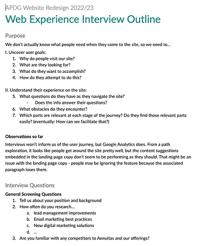
We didn’t know much about our current and prospective customers in the realm of our website – who uses our site and why, the questions that keep a UX designer up at night – so we took this opportunity to start talking with real users. I drafted a three-pronged research approach involving interviews, quick on-site surveys, and remote site monitoring. We successfully sourced interviewees that matched all the personas from current and previous clients.


Figma prototypes for web surveys I planned to implement
The introduction section of the Interview document
Although the surveys and site monitoring proved impossible (cookie policies and insufficient resources), the interviews provided valuable feedback. Here are the key themes:
Theme 1: Who’s on the site
We learned when each persona group might visit the site in their journey and what information they typically seek.
Theme 2: Why they’re on the site
Though most of our clients come through word of mouth, the ones who did engage with the website either came to learn from our resource center or to find social proof and a description of our methodology.
Theme 3: Current impressions of the site
Clients agree that our pitch is strong, but we use too much jargon. Stripped-down, outcome-oriented language would be more effective. They would also like to see a stronger human aspect since consulting is built on confidence in the people.
Theme 4: Greatest opportunities for improvement
Our content could reach greater potential if we presented it in a more digestible manner and put more effort into highlighting our differentiators.
In tandem with our interviews, Jon and I established the foundation of the new brand identity. Looking at brand archetypes, we identified the company personality as 70% Sage, seeking to impart wisdom and lift up others, and 30% Ruler, leading the way and commanding respect and authority. As we moved into later phases, we kept this identity in mind – validating it in interview feedback and using it to guide our site narrative, tone, and colors.
Discovering the user journey
I added the web user information (reason for site discovery, goals, interaction mode, and pain points) to our existing personas to create enhanced personas, and then created a set of user story cards with the general format:
I am a {position that fits in a persona}. I want to {accomplish a task} because of {known motivations/objectives}.

An Enhanced Persona: Original information in black, new information in green
There were enough cards to cover the full range of possible goals, but in order to focus on major user needs, we narrowed the set to the primary task (or tasks) for each persona. Interestingly, many of the secondary story cards could be fulfilled by ensuring a clear path to achieve the primary story card.

User story cards that I used to guide the user journey development
And then the moment arrived for… ✨collaboration✨. I led a user journey workshop with the full team so that the business strategy experts and customer-facing members could keep the user journeys on the rails. Starting from the initial problem, we explored what the web user would be feeling and seeing at each step and what we would need to present to fill their needs and move them to the desired outcome. At the end of the session we had drafts of the first two journeys in Figjam; I completed those along with the remaining journeys before moving forward to information architecture.

Workshop artifact: our board in Figjam used to explore a possible user journey


The 4 finished user journeys
Getting into the nitty-gritty of the problem
Information Architecture
We started with a series of website story workshops to make sure that development, marketing, and sales considerations were included in the foundation of the site. In these sessions we focused on establishing the information architecture – not just defining the navigation but also blocking out the flow of the site’s story across the pages.
We began by rethinking the navigation. We realized through the interviews that our site was overlooking the most important question: What makes us different and why should anyone work with us? Thus we placed a page dedicated to that subject first in the menu. Its content would appeal to any visitor, but we knew from strategy research that it would meet the particular needs of our first persona, the Driver, aka chief decision maker.

Working out the site story as a team – Information architecture for primary pages


Zoom in: blocking in the site and describing the purpose of each section
That page was followed by two existing pages that we redesigned to better answer their title questions.
-
We re-outlined “What we do” to be a to-the-point, jargon-free list of our services and capabilities, perfect for the Advocate persona focused on tactical information.
-
“How we do it” would be a streamlined overview of our proprietary process, intended to provide enough detail for Change Agents, the second persona, to guide their departments or seek executive support.
Finally, we added another page to address the second gap in the site’s content, case studies, since interviews revealed that these are the principal way that prospects evaluate our capabilities.
As we crafted the narrative to support the new navigation, we aligned on the appropriate tone to match our brand personality, the lens through which we would explain our business and select site details, and strategies to address diverse web visitor needs in a cohesive manner.
Wireframing
After finalizing the site outline with the team, I began translating it into wireframes, sharing my progress weekly. Our goal was to create a simple yet sophisticated MVP that would lay the groundwork for future advancements, so I focused on layouts and elements that promoted the site narrative rather than overcomplicating the pages. I began each screen by looking for the simplest way to represent the content outline, after which I considered how to enhance the message, generating a plethora of page versions. By demanding a reason for each addition, I kept myself from building distracting decoration.


A side-by-side comparison of an early-process draft of the homepage with the final wireframe

A million iterations of one landing page
Wireframing presented a unique challenge: since much of our feedback in interviews centered on the website’s language, a major part of the project’s strategy centered on the narrative rather than innovating the web features. And while we had a full content outline, the start of actual copywriting would begin much later in the project.
Enter intent text.
Instead of using placeholder lorem ipsum text, I used descriptive copy of what sections should accomplish and with what tone. That description along with some lorem ipsum to convey expected text length helped me design for the future copy and properly convey the spirit of the wireframes to the team. In later phases of the project this text reminded us of the strategy behind the team’s decisions


Examples of intent text in the wireframes
I kept in mind the interview feedback as I built out the details of each section. We established that we needed to include less theory and more results-based language, and find a more approachable and empathetic conversation style. In wireframe review sessions the team came up with several ideas to meet that challenge, often borrowing concepts from other industries such as therapy providers. For example, we created a progressive quiz on the homepage that would generate a brief assessment of the visitor along with a customized “first step” on their journey on the website. We also took inspiration from Choose Your Own Adventure (CYOA) novels. We realized that we needed to cater to the needs of unidentified prospects, so I designed the pages to offer the ability to dive deeper, find related information, or take action at various points so that a visitor always had the tools to accomplish their goal.


One fully-designed version of the homepage quiz, an application of the CYOA theme
As we referred constantly to the research findings throughout wireframing, we were able to create solutions that addressed each of the key interview points.
-
The information architecture addressed theme 1 by providing pages designed for each persona.
-
Our focused content outline satisfied theme 2’s reasons that clients and prospects visit the site. The CYOA-focus allowed us to account for unknown motivations.
-
The intent text outlined the copy that would solve the negative impressions of the site mentioned in theme 3.
-
Our new layouts and content sections prioritized digestible content and highlighted differentiators as mentioned in theme 4.
High Fidelity Designs – It Gets Real
Near the end of the wireframing I returned to developing the visual identity, starting with some inspiration research before diving into the color palette and font choices. To make the palette more flexible, we needed to add more shades of both colors and neutrals. The expansion gave us the ability to create vibrant pages without verging on childish or abrasive. As for the font, we were originally working with Lato, which was legible but lacked character, so I scoured the internet for a second font that would pair well with it and help set the tone. Eventually I discovered a serif font that was both sophisticated and playful, and that became the headline and CTA font.

Visual inspiration research


Working to expand the color palette and finding a good font pairing
Jon and I each then developed a homepage concept in a distinct visual direction that reflected a combination of our two archetypes, Sage and Ruler. When we brought the two finished concepts to the team for discussion, we decided to ask the clients to evaluate them. We sent out a sentiment analysis via google form; it provided a link to both versions of the homepage, each followed by a list of words that we’d identified in strategy work as descriptors we wanted to emulate or avoid. The form asked the participants to rate each page against these words and to provide final thoughts if they wished.


A glimpse of my homepage design exploration


Design direction 1


Design direction 2


Client survey and the results
The feedback revealed that each design was too extreme; mine was too heavy on the Ruler, and Jon’s too heavy on the Sage. I pulled out the strengths of each version and blended them to create a balanced aesthetic that matched our brand personality.


Final homepage, a marriage of two identities
We decided to use dark backgrounds to convey authority and highlight important information, but light backgrounds for content-heavy sections to make information absorption calm and inviting. Jon and I chose to limit the use of photography to prevent the site from looking like a generic tech company template. Instead we created or adapted illustrations for most of our visuals (process diagrams, concept illustrations, icons and badges), reserving photography for sections featuring employees and company culture or for hero images tinted to our brand colors. Blue became our neutral rather than gray because it had more character, conveying either a relaxing and approachable or strong and stable influence depending on the shade. We both expanded and limited the use of the brand green – we restricted the action shades solely to clickable elements, but we sprinkled the other shades into illustrations, backgrounds, and gradients to highlight brand-specific concepts. On the other hand, we found that yellow, which was previously represented almost equally in the branding, didn’t match the new personality, so we reserved it for occasional pops of energy.
Using the homepage as a baseline, I set up the beginnings of a style guide and component library that I expanded and refined throughout this phase.

Bits of the design system and component library
I worked through the pages of the site as sections, lined up in an order dictated by page priority, development timeline, and content migration. Each week I would run through countless ideas for each page in a section, narrow the options, and consult with Jon. After the check-in, I would revise, present to the team, revise, and move on to the next section. Every page cycle gave me the opportunity to scrutinize and iterate on previous choices, refine the brand, and brainstorm new ways to represent concepts. As a result, some elements were introduced, such as the gradient backgrounds, some layouts were simplified to be reusable and development-friendly, and many patterns were standardized to increase consistency across the site.


Some shots of the final site design
Handing it off – close but not quite
Handing the designs off proved to be a more involved process than expected. While I was designing, I tried to create robust components with interaction states and consistent variations, but during hand-off I realized how being immersed in the process can lead to a designer making assumptions about what is understood. We ended up going back and forth extensively to clarify functionality, adjust responsive page behavior, and improve documentation, but teamwork and patience prevailed.
By the QA phase we had a well-oiled process for documenting, discussing, and tracking the rectification of gaps between the design and finished product.
Looking Back
The value of collaboration
Holding full-team workshops and team reviews throughout the project helped me realize that the benefits of collaboration go beyond getting fresh ideas. Getting the team involved generated project hype; it made people excited to put on their creative hats, and that enthusiasm improved our workflow. It also made the team more dedicated and willing to fight for resources as internal projects are often deprioritized.
Testing
I’ve always been a firm believer in testing designs from the start, and compromising on that would be my biggest regret in this project. I still look forward to getting feedback post-launch, but nothing replaces the ability to catch false assumptions and uncover unexpected insights by testing ideas in formation.
Creative control
Though it was daunting to be starting a branding and redesign project at the same time, it was nice to have a blank slate. Since we had complete control over both sides, we never encountered conflicts between brand guidelines and design ideas. The visual identity is web-native, honed to bring the best out of the site and our content.
Along the same lines, building most of our visual elements from scratch was challenging but liberating; I didn’t have to settle for visuals that didn’t quite fit the message or aesthetic.
Communication
The fundamental lesson of the project: Communication is the key to everything. There’s always something to work on, this project being no exception. I’m pleased with the results of the collaboration experiments and team reviews, but I see room for improvement in documenting and explaining my designs. Obviously the hand-off revealed the flaws, but I recognize now the need to foster conversations with developers that surface assumptions and questions before designs are even completed. I realize as well that communication should be multifaceted – meetings and videos are great, but robust prototyping is an essential means of communication since it both conveys ideas and provides a starting point for discussion.
I’m looking forward to seeing the site go live and analyzing how it serves, and can better serve, user needs.